Talking about Obamacare’s effects is one thing; seeing hard data is another.
Heritage’s newly updated Obamacare in Pictures has 15 charts
that show the law’s effects on Americans—from canceled insurance
policies to new taxes, Medicare cuts, reduced choice for plans, and
more.
Here’s a quick look at just three of these charts and how Obamacare is hitting three groups.
YOUNG PEOPLE
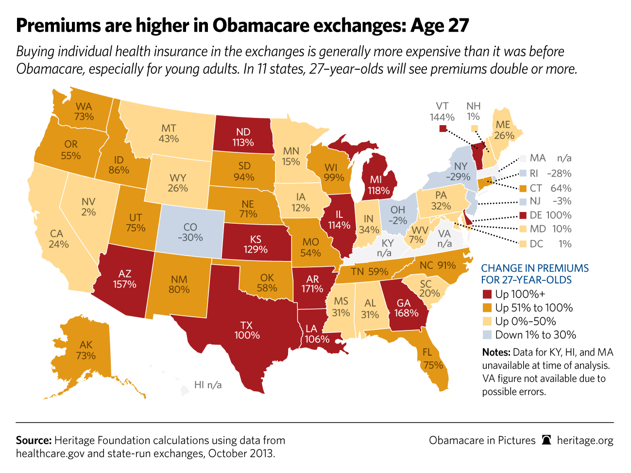
See original work for more on this and other stories.
No comments:
Post a Comment
Spamming will be removed.
Due to spamming. Comments need to be moderated. Your post will appear after moderated regardless of your views as long as they are not abusive in nature. Consistent abusive posters will not be viewed but deleted.
Note: Only a member of this blog may post a comment.